
A Logo That’s Farm Fresh!
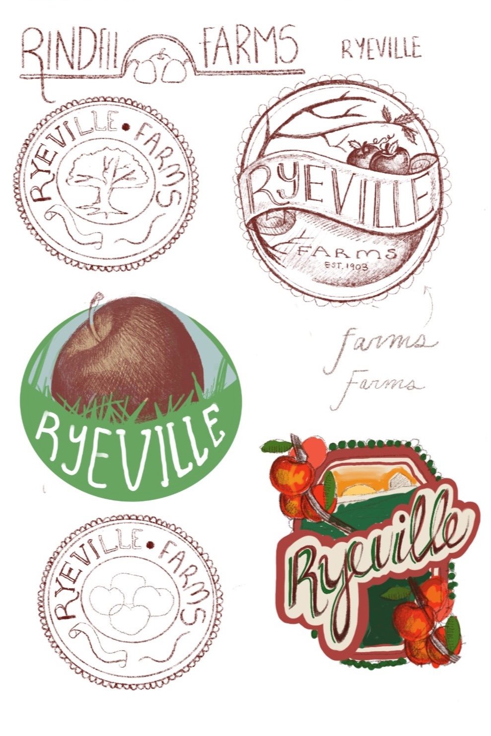
For the brand identity of Ryeville Farm I knew I wanted the feel of a modernized apple picking farm. I was inspired by my trip to an apple orchard and was impressed by their use of graphic design and illustration. It was so effective that I strived to replicate that experience with a fictional brand. I researched other farms, seeing how they utilized design. I studied how they engaged customers and achieved their overall aesthetic that keeps customers rolling in for cider donuts and farm fresh apples every September. I studied what inspired the “farm aesthetic”, digging through old illustration styles, cooking texts, old magazines and farming advertisements. After lots of research and decision making, I settled on banner style typography and a frilled circle frame, stripping away some of the illustrations. If I wanted to capture the modern look of the brand, I had to step away from including too many illustrated elements because of the way it aged the product. The fonts and design elements showed the history of the farm while keeping the logo clean and farm fresh!

“More than anything, I wanted to show that the company was growing while still sticking to its roots. ”
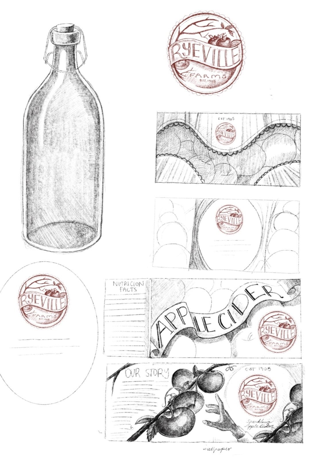
While designing the packaging for the Ryeville goods, I wanted the design to appeal to both a commercial audience and a local audience. I started off by sketching very rustic designs, heavily inspired by old illustration. However, though I wanted the labeling to be reminiscent of early 1900s graphic design, I also wanted to create a sophisticated feel that would help Ryeville products stand out against other small farms in local stores . I achieved this through my choice of typography , design elements such as boarders and frills, and illustrations. The Illustrations I created allude to botanical illustrations that were often associated with farming advertisements and cooking materials from the early 1900s. All of this was important in selling the aesthetic of a aged and trusted brand that is still relevant within the farming world. More than anything, I wanted to show that the company was still growing while sticking to its roots (no pun intended)!

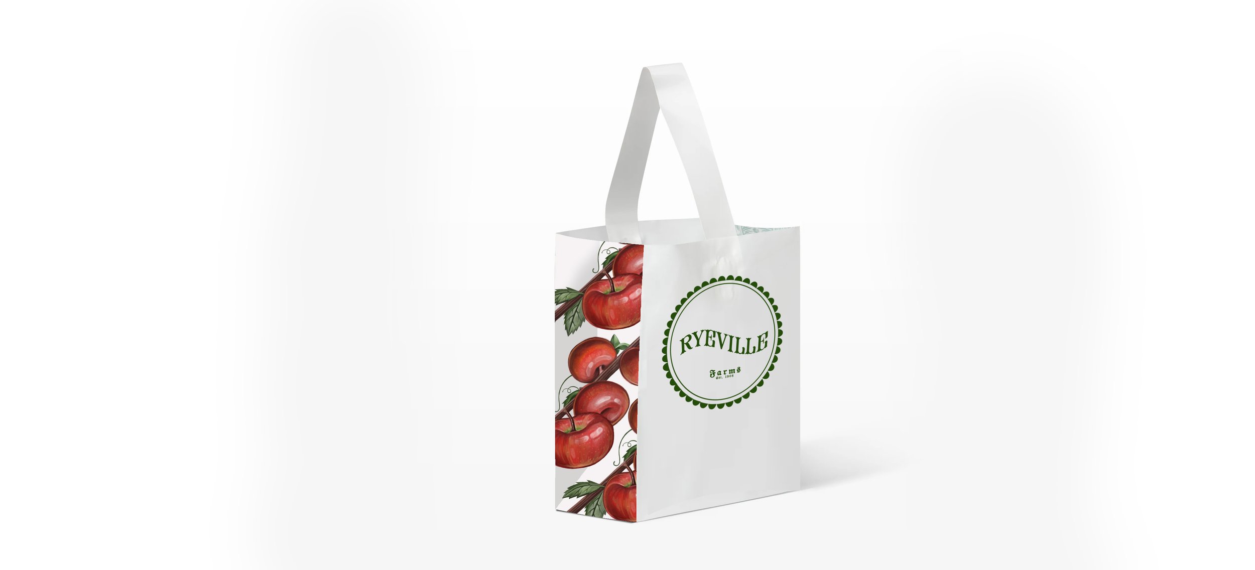
Ryeville Apple Picking Tote Design

Ryeville Apple Picking Tote Design
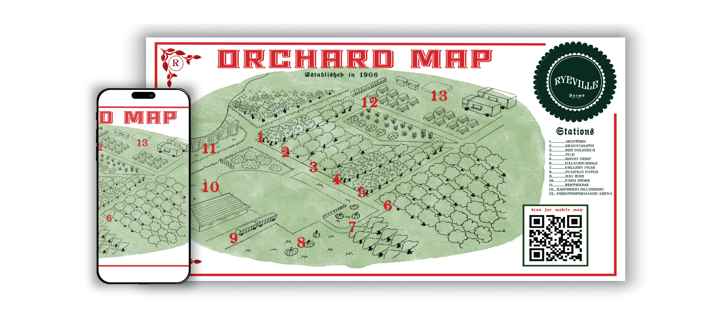
Ryeville Illustrated Map and Map Design
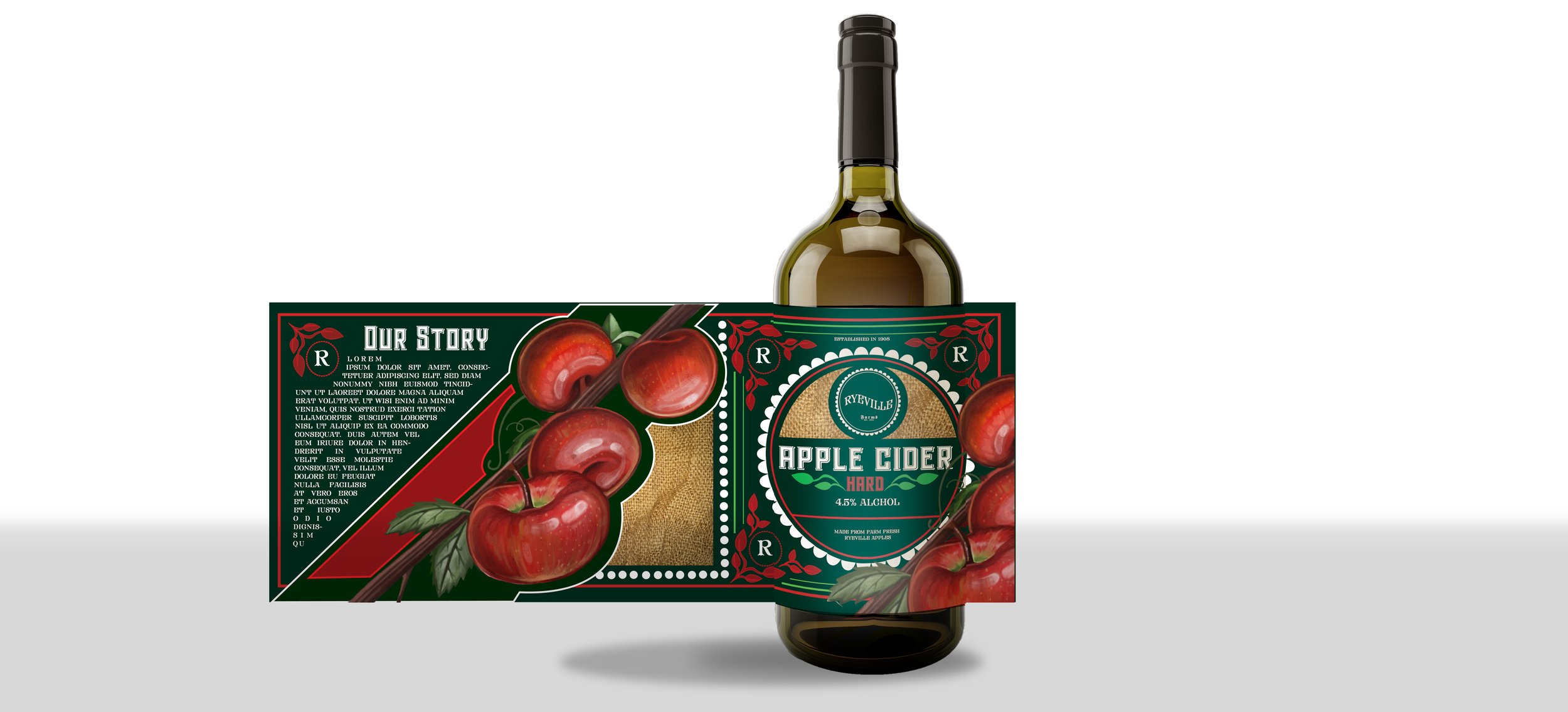
Ryeville Apple Cider Packaging Design
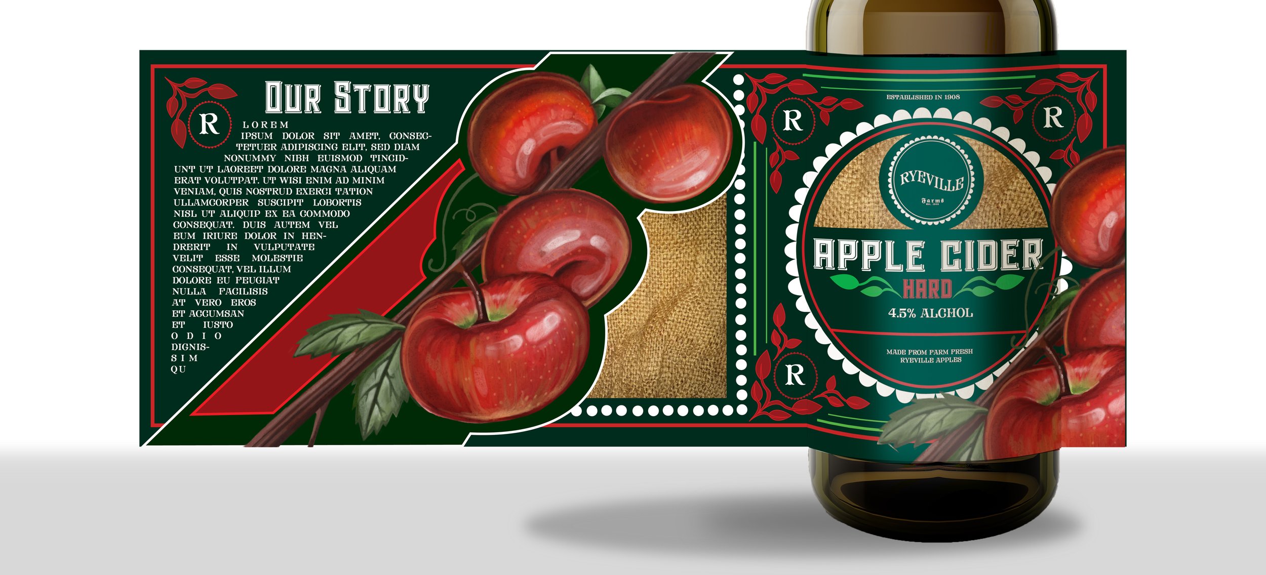
Ryeville Apple Cider Packaging Design

Ryeville Apple Cider Packaging Design
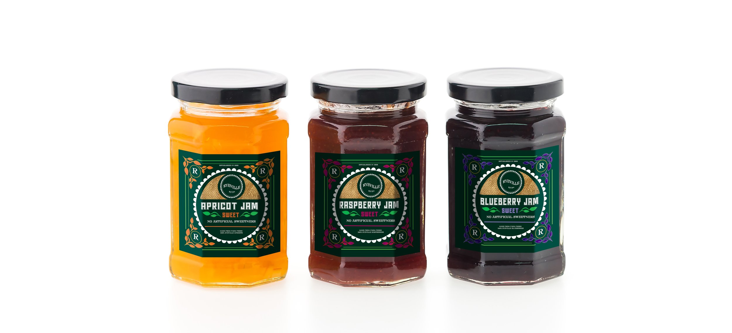
Ryeville Jam Packaging Design
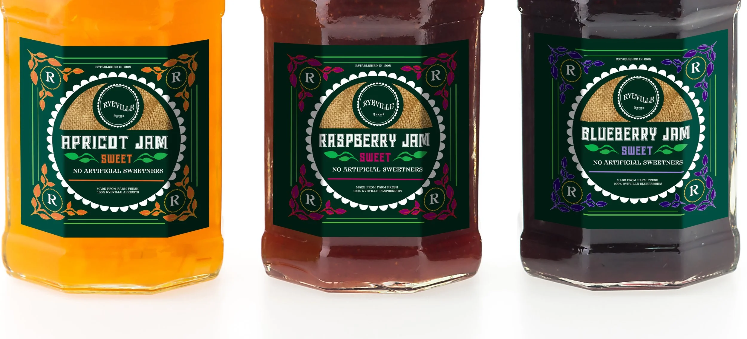
Ryeville Jam Packaging Design